
CoReMQ
B2B SaaS enterprise workflow redesign supported by scalable system patterns


About
While working as a Product Designer at WongDoody, a design agency based in New York, I contributed to Honda CoReMQ—an enterprise quality-management platform supporting engineers, and managers across complex quality workflows.
Over a seven-month design engagement, I led the redesign of the Homepage Dashboard and Commonized Attachment experience. I translated field research, complex business rules, role-based permissions, and engineering constraints into scalable, development-ready workflows.
Impact
The project delivered six executive-approved, development-ready features for phased implementation. By simplifying complex engineering workflows through clearer task visibility and standardized interaction patterns, the redesign established a scalable foundation aligned with Honda's long-term platform modernization roadmap.
Timeline
2 Phases
7 Months
Team
Product Designer - Me
Product Director - Adam F
Product Designer - Josh C
Sr. Product Designer - Pareesa K
Product Manager - Vinny M
Cilent Partner - Josh H
3 Software Developers
My Role
User research
Workflow mapping
Information architecture
UI design
Prototyping
Accessibility review
Design handoff
Challenge
A 20-Year-Old Platform Supporting Complex Quality Operations
CoReMQ supports the quality-management lifecycle—from identifying issues and reviewing technical evidence to approval, resolution, and tracking.
However, its legacy workflows made it difficult for engineers to identify urgent work, manage attachments efficiently, and understand system status.
2 Function solutions at a glance
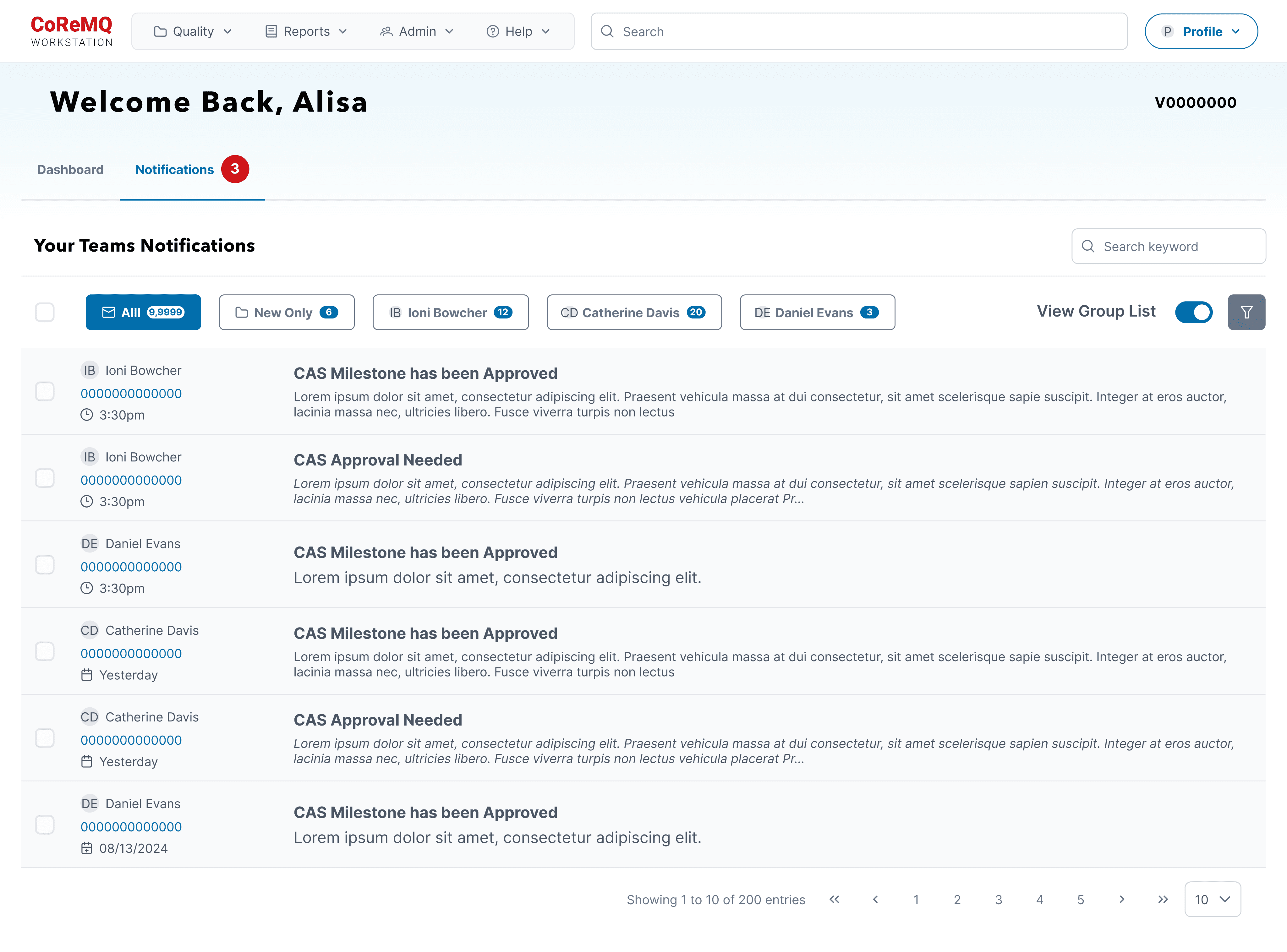
Function 1 Homepage Dashboard - Making urgent work immediately visible
A centralized operational dashboard helps engineers identify pending tasks, SLA risks, and workflow bottlenecks without navigating across multiple pages.

❌ Before
Limited Workload Visibility
The homepage did not provide enough task-critical information for users to quickly understand their workload, task status, and important updates.
Poor Worklist Scannability
The worklist area was too small, making it difficult to scan and manage multiple tasks efficiently.
Lack of Prioritization
Don’t allow users to prioritize the information and features most relevant to their roles.
Unreliable Quick Search
Quick Search was slow and often failed to return the records
Inefficient Task Discovery
Users had to manually sift through the worklist to find relevant tasks and records.

✅ After
Surface Key Information
Introduced visual metrics, task summaries, and status indicators to help users assess their workload and priorities at a glance.
Expand/ Clarify the Worklist
Increased the worklist area and improved the information hierarchy to make tasks easier to scan and manage.
Homepage Customization
Added customizable modules so users could bring the most relevant metrics, tasks, and tools to the forefront.
Enabled Quick Search
Redesigned the search experience to provide faster access to relevant records and more task-critical information in the results.
Improve Task Prioritization
Surfaced high-priority, overdue, and recently updated tasks directly on the homepage.
Function 1 Homepage UI flow




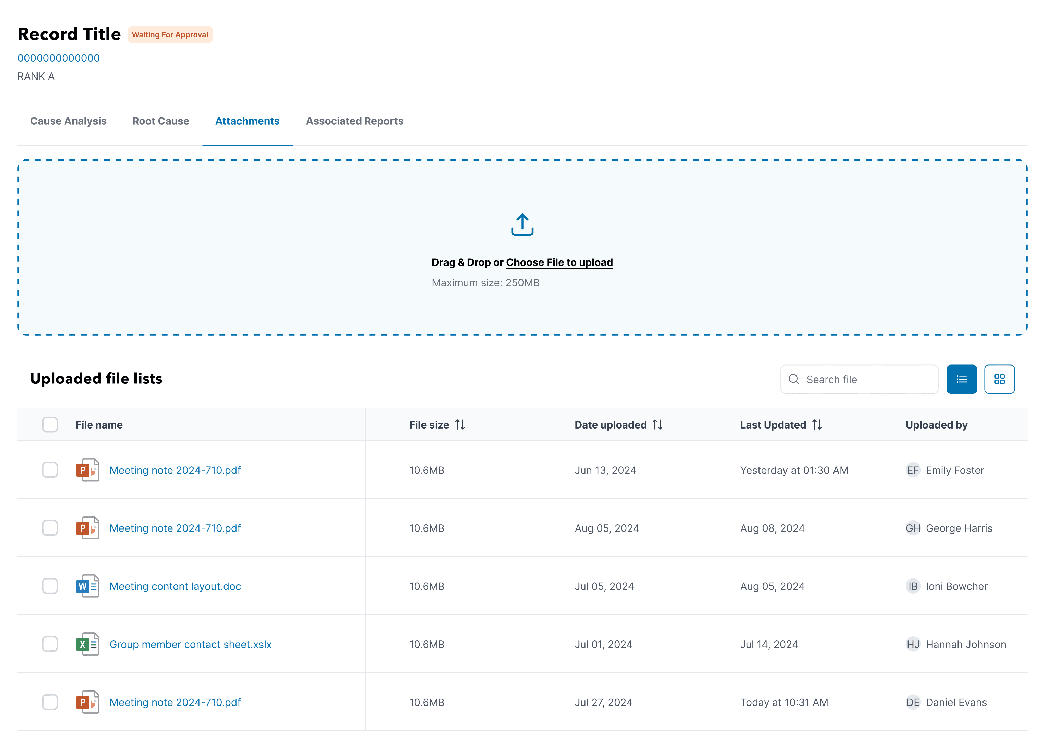
Function 2 Commonized Attachment - Standardizing file management across record types
A reusable attachment experience introduces multi-file upload, bulk actions, previews, progress feedback, and consistent file-management patterns.
❌ Before
Limited Bulk Actions
The existing experience lacked multi-select capabilities, preventing users from handling multiple files efficiently.
Poor Upload Visibility
Users received limited feedback during the upload process and could not clearly understand file progress, completion, or failure.
Limited File Organization
The attachment flow did not adequately support users’ real-world file naming and organization needs.
Inefficient File Handling
Users had to manage attachments one by one, making repetitive upload and download tasks time-consuming.
Difficult File Verification
Insufficient file information made it difficult to confirm whether users had uploaded the correct files.


✅ After
Enable Multi-File Actions
Added multi-select, batch upload, and batch download capabilities to reduce repetitive file handling.
Improve Upload Feedback
Introduced drag-and-drop uploading, progress indicators, file validation, and clear success or error messages.
Strengthen File Organization
Improved the file-list structure and naming patterns to make attachments easier to identify, scan, and manage.
Centralize Attachment Management
Created a experience where users could upload and download files from a consistent interface across record types.
Surface File-Critical Information
Displayed clearer file names, formats, sizes, types, and upload statuses to help users verify attachments quickly.
Functon 2 Commonized Attachment UI flow



Developer handoff
I treated developer handoff as part of the design process rather than the final delivery step. I worked closely with the Product Manager and engineering team to clarify interaction logic, document edge cases, and ensure the proposed workflows could be implemented within the existing CoReMQ system.
Annotation for developers
I added detailed annotations directly in Figma to explain component behavior, interaction rules, user permissions, and system responses.


For this example, I annotated the PrimeNG components, interaction rules, role-based permissions, and dynamic SLA behavior directly in Figma. These specifications clarified Honda-specific customizations and edge cases, reducing ambiguity during development.
Design System
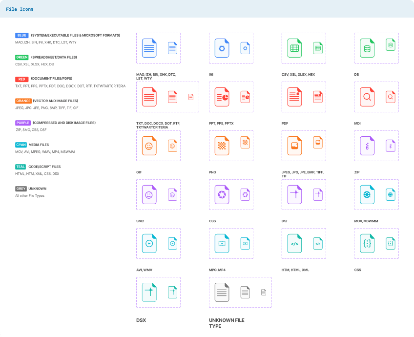
I worked within an existing enterprise design system and adapted it to meet the specific needs of CoReMQ. This required collaborating with a large, pre-defined component library, identifying what could be reused directly, and customizing only where necessary.
Honda project

In some cases, the default components did not fully meet accessibility or usability requirements. I had to dive into details such as color contrast, visual hierarchy, and interaction clarity, and make careful adjustments to ensure compliance with accessibility standards while maintaining consistency with Honda’s visual guidelines.
By balancing reuse and customization, I ensured the interface remained consistent with the broader design system while still supporting the specific workflows and constraints of the CoReMQ platform.
Responsive Design
Alhough CoReMQ is primarily used on desktop, the interface needed to remain functional across different laptop resolutions and browser sizes. I designed and tested three key breakpoints—1278px (Min), 1440px (Med), and 1920px (Max)—to ensure layout consistency and usability across common workstation setups.
These responsive rules helped the engineering team implement more predictable layouts rather than resolving each screen size independently.
Showing part of the responsive design:


Takeaways
This was one of the largest and most complex projects I had worked on, teaching me how to create clarity across interconnected enterprise workflows.
I learned to take ownership of individual workstreams while ensuring each solution aligned with the broader platform and design system.
I translated user feedback, stakeholder input, and business requirements into clear product decisions rather than isolated UI changes.
I designed within technical constraints while creating reusable patterns that could scale across future features.
I treated documentation, developer collaboration, and design QA as essential parts of delivering a successful product experience.